Creating a Premium Mobile-First Design for Membership Websites
DR
In today's digital age, creating a mobile-first design for membership websites is not just a trend but a necessity. With the majority of users accessing content via their smartphones, ensuring a seamless mobile experience can significantly enhance user engagement and retention. But what exactly does a premium mobile-first design entail, and how can it be implemented effectively for membership websites?
Understanding Mobile-First Design
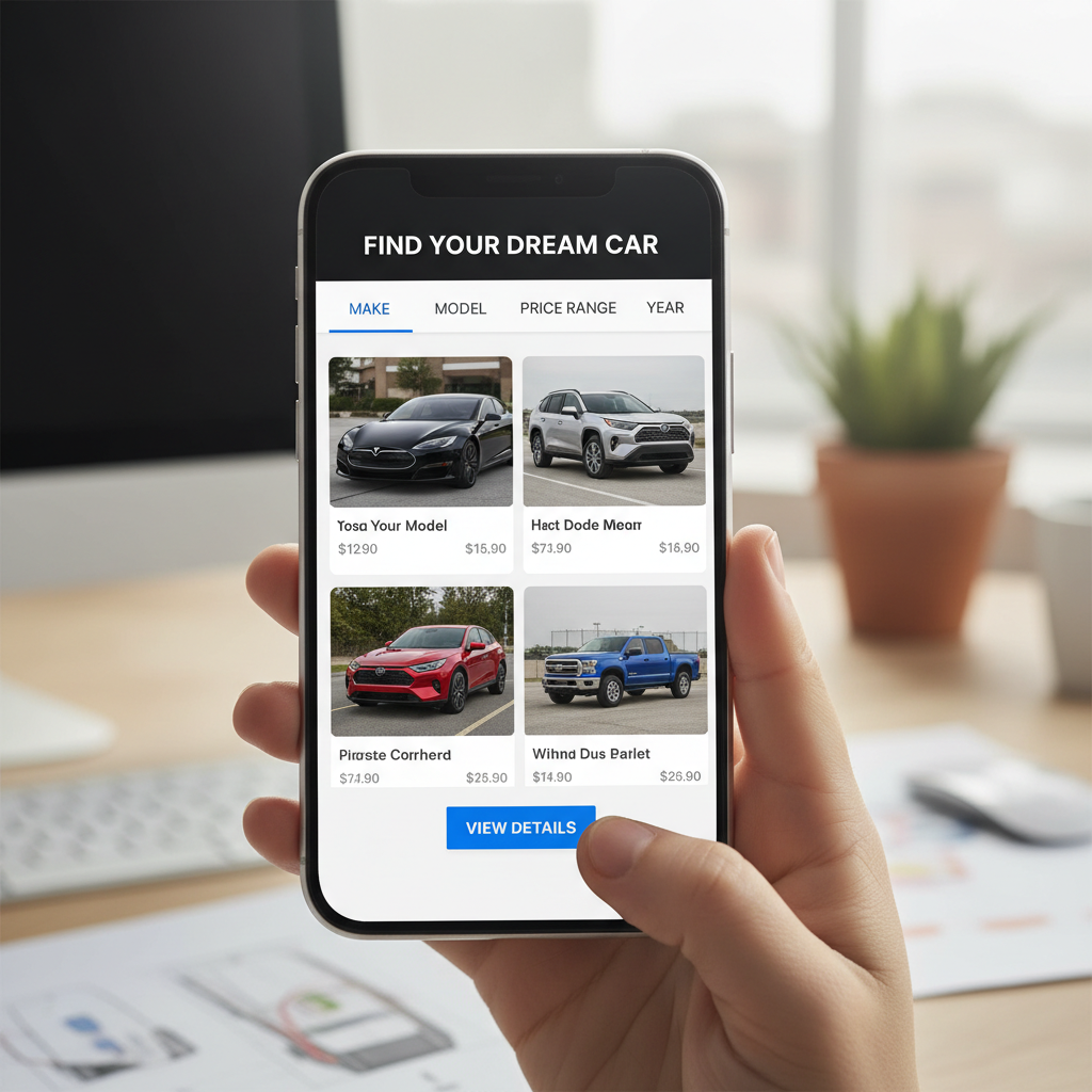
Mobile-first design is an approach that prioritizes the mobile user experience before scaling up to larger screens like tablets and desktops. By focusing on the constraints of smaller screens, designers can create more efficient and user-friendly interfaces. This strategy ensures that the most important elements are front and center, providing a streamlined experience.
For membership websites, this approach means simplifying navigation, enhancing readability, and ensuring that interactive elements are easily accessible. The goal is to create a design that feels intuitive and engaging, regardless of the device being used.
Key Elements of a Premium Design
To achieve a premium mobile-first design, certain key elements must be considered. These include:
- Responsive Layouts: Ensure that your website automatically adjusts to fit any screen size, maintaining functionality and aesthetics.
- Fast Load Times: Optimize images and code to improve load times, which is crucial for user retention and SEO.
- Touch-Friendly Navigation: Design with larger buttons and ample spacing to accommodate touch inputs.
Optimizing Content for Mobile
Content is king, but how it is presented on mobile devices can make a significant difference. Start by prioritizing content that adds value and is essential for the user experience. Avoid clutter by using concise text, bullet points, and headings to break up information.
Visual content should also be optimized. Use high-quality images that load quickly and enhance the overall aesthetic. Videos should be embedded in a way that allows them to play seamlessly on mobile devices.
Enhancing User Experience
A premium mobile-first design for membership websites should enhance the user experience at every touchpoint. This includes personalized user interfaces that adapt based on user preferences and behavior. Implementing features like personalized dashboards and content recommendations can significantly boost user satisfaction.
Additionally, consider incorporating feedback mechanisms, such as surveys or chat support, to provide users with a platform to express their needs and preferences. This can lead to continuous improvement and a more tailored experience.
Testing and Iteration
Once your mobile-first design is implemented, rigorous testing is essential. Use A/B testing to determine which design elements resonate most with your audience. Regularly review analytics to understand user behavior and identify areas for improvement.
By continuously iterating on your design based on feedback and data, you can ensure that your membership website remains both functional and visually appealing, meeting the evolving needs of your users.
Conclusion
Creating a premium mobile-first design for membership websites is a strategic approach that prioritizes user engagement and satisfaction. By focusing on responsive design, optimizing content, and enhancing the user experience, you can create a site that not only attracts but retains members. As mobile usage continues to rise, adopting a mobile-first mindset will position your website for long-term success.